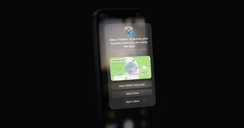
iOS 26 will be using a ‘Liquid Glass’ UI redesign according to a last minute report, ahead of WWDC25. Here’s what to expect.
Expect Translucent, Glass-Like Buttons, Toolbars, and Glossy Reflecting Icons Across iPhone, iPad, Mac, Watch, and Apple TV
Mark Gurman reports that Apple’s official announcement will include specular highlights, rounded icons with shiny borders, and revamped layouts that tie together Apple’s software ecosystem.
Controls like tab bars, buttons, and toolbars will appear more fluid and modern, syncing well with rumored future devices, such as the 20th anniversary iPhone for 2027, featuring curved edges and no bezels.
There’s even a concept version called Liquid Glass, designed by a former Apple UI designer, which pushes this idea further by imagining sleek transparency and reflections that feel intuitive and immersive. If Apple’s final version matches this concept, it will be a big win for consumers.
Related: WWDC 2025 Keynote: When and Where to Watch in Your Timezone
But this redesign raises questions: how will older iPhones handle these visual effects? Devices running older chips like the A12 or A13 might struggle to render smooth transparency without lag. Apple could offer scaled-down versions of the UI or reserve some effects for newer hardware, similar to how some macOS features differ between Intel and Apple Silicon models.
Why This Matters
- Unified look across devices: Apple is prioritizing visual harmony across its OS lineup—iPhone, iPad, Mac, and TV.
- Easier interaction: Glassy buttons and toolbars could feel more responsive and intuitive.
- Hardware synergy: Design changes align with upcoming hardware, and may push users toward newer devices.
Still, software innovation should not penalize users with older hardware. If Apple smartly adjusts effects or limits them on legacy devices, the redesign could be a strong step forward. We’ll find out during tomorrow’s WWDC25 keynote. Stay tuned!


