


Apple’s long-rumored foldable iPhone is finally starting to take shape, and one newly revealed detail stands out more than any hinge, crease, or camera placement: the foldable iPhone, or iPhone Fold will be wider than it is tall when unfolded.
That single design decision could end up defining how Apple’s first foldable feels, functions, and competes in a market already dominated by Samsung and Google.
A Wider Foldable, Not a Taller One
According to a recent report from The Information, Apple’s foldable iPhone will feature:
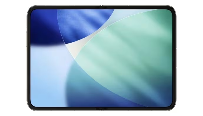
- A 5.3-inch outer display when closed
- A 7.7-inch inner display when unfolded
Those numbers alone are not shocking. What is different is the aspect ratio.
When fully open, the iPhone Fold’s inner screen will be landscape-leaning, meaning it will be more wide than tall. In other words, it behaves less like a stretched phone and more like a compact iPad.
This is a notable departure from current foldables on the market.
How this Compares to Samsung and Google
Most foldable phones today still feel like tall smartphones that happen to open up. Even when unfolded, they retain a vertical bias.
For context:
- Samsung Galaxy Z Fold series unfolds into a tall, narrow tablet
- Google Pixel Fold models follow a similar upright approach
- The Samsung Galaxy Z TriFold however, offers a wide display thanks to its trifold mechanism.
Apple appears to be rejecting that philosophy entirely. Instead of optimizing for one-handed vertical scrolling, Apple seems to be designing the iPhone Fold as a mini tablet first, phone second.
Think iPad, Not Galaxy Fold
The best comparison for Apple’s approach is not another foldable phone, but Apple’s own iPads in landscape mode.
A wider display opens the door for:
- Better split-screen multitasking
- More natural video playback
- Improved app layouts, especially for iPad-optimized apps
- A less cramped keyboard experience
This also aligns neatly with Apple’s long-standing preference for landscape-friendly interfaces, particularly on larger displays.
The Obvious Problem: Usability When Closed
Of course, there is a trade-off.
A wider unfolded screen usually means compromises when the phone is folded shut. A 5.3-inch cover display is smaller than what many users are accustomed to on modern iPhones, and it raises questions about typing, scrolling, and everyday use without opening the device.
Apple will need to rely heavily on:
- Smart UI scaling
- Aggressive continuity between folded and unfolded states
- Possibly rethinking how apps behave on the outer display
If anyone can pull that off, it’s Apple, but it is still the biggest risk facing the iPhone Fold.
A Deliberate Break from the Foldable Norm
What’s clear is that Apple is not trying to out-Samsung Samsung. By making the iPhone Fold wider than it is tall, Apple is signaling that this device is meant to feel distinctly Apple, not like a refined version of an existing Android concept.
It is a bold choice, and one that suggests Apple sees foldables less as experimental phones and more as pocketable iPads.
Whether that gamble pays off will depend on execution, but from a design standpoint, Apple is already charting its own path.
And if this report holds true, the iPhone Fold won’t just fold differently. It will think differently, too.