
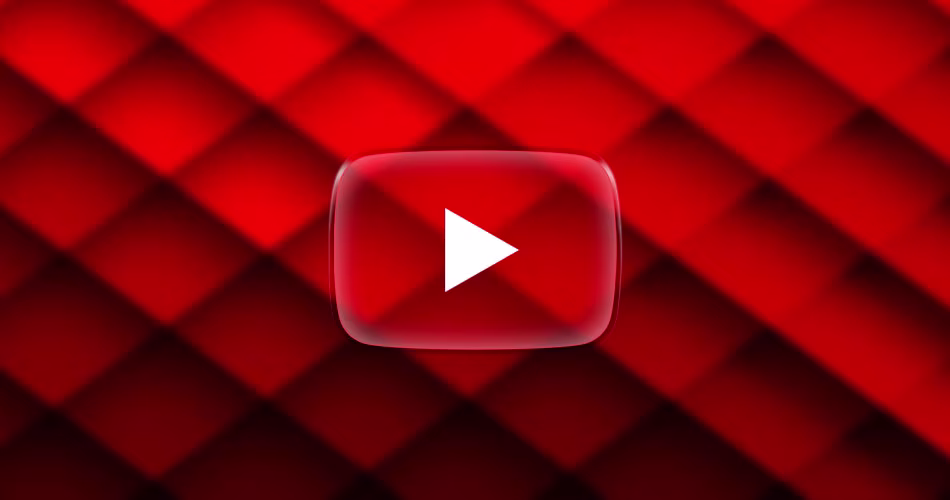
YouTube is rolling out a redesigned video player on the web featuring a new Liquid Glass-inspired look with transparent UI bubbles and rounded controls. Here’s what’s changing.
YouTube’s New Video Player Is Giving Major Liquid Glass Energy and Most Users Are Not Too Pleased
YouTube is shaking things up on the web again, this time with a major video player redesign that brings in a fresh, modern look. If you’re suddenly seeing a slick new layout with rounded buttons and transparent UI bubbles, you’re not imagining it. It’s real, and it’s rolling out now.
What’s New in the YouTube Video Player?
Over the past 24 hours, users have been spotting a completely revamped video player interface. The biggest change? Each control is now tucked into its own subtle “bubble,” and the whole design feels eerily similar to Apple’s new Liquid Glass UI seen in iOS 26 and macOS Tahoe.
Here’s what stands out:
- Transparent UI elements with a soft blur effect
- Rounded design for buttons and controls
- Layout variations depending on user and region
- Still in testing for some, but a wide rollout is likely underway
It’s a bold new direction for YouTube, which hasn’t made major UI shifts in years. The last big one? Rounded video corners in 2023, and even that stirred debate.
Test or Rollout?
Not everyone is seeing the change yet, which suggests YouTube might still be A/B testing or doing a slow rollout. If your video player still looks the same, don’t worry, you’ll likely see the update soon, or maybe not if it’s an A/B testing and community reactions are anything to go by.
Community Reaction
As always with YouTube UI changes, the feedback is mixed. Personally, I think it looks modern and fits right in, but I’ll wait for the change to roll out to my devices before I can be truly sure.