Well, it finally happened. Google has updated its famous “G” logo for the first time in nearly a decade. And no, your eyes aren’t playing tricks on you. That little icon you’ve been tapping every day now has a fresh coat of paint… kind of.
No More Bold Blocks of Color
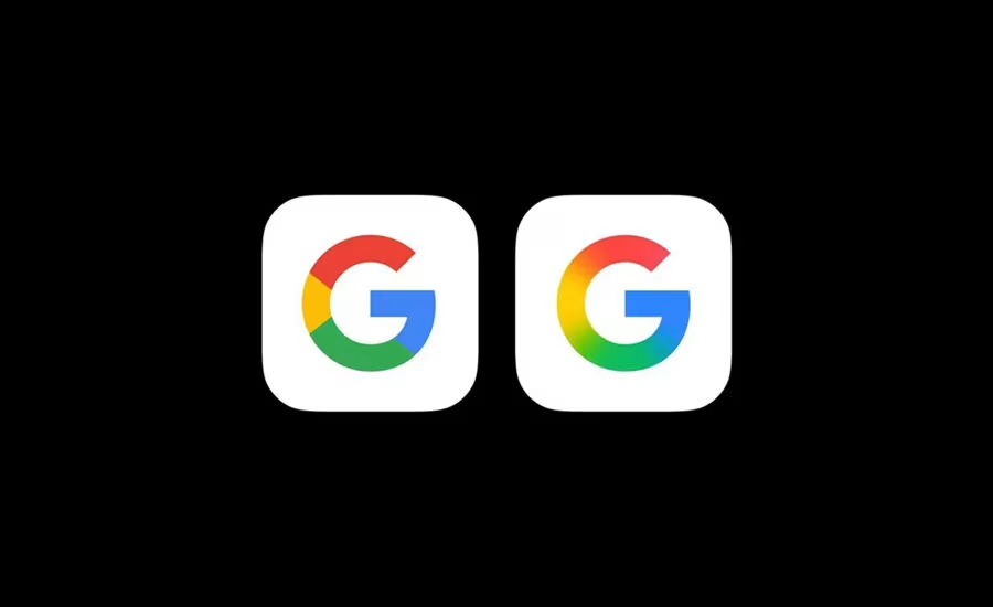
Picked up by 9to5Google, the new version of the “G” is now sporting a smooth gradient that blends Google’s signature red, blue, green, and yellow into a more unified, modern look. Think of it like a soft, digital watercolor versus the old-school hard-edged crayon vibe we’ve all gotten used to. It’s subtle, but if you’re the type who notices when apps move a pixel to the left, you’ll see it.
This isn’t the first time Google has changed things up. The last major logo update was back in 2015, when the tech giant ditched its old serif typeface in favor of a cleaner, sans-serif look and dropped this colorful “G” badge as part of the redesign.
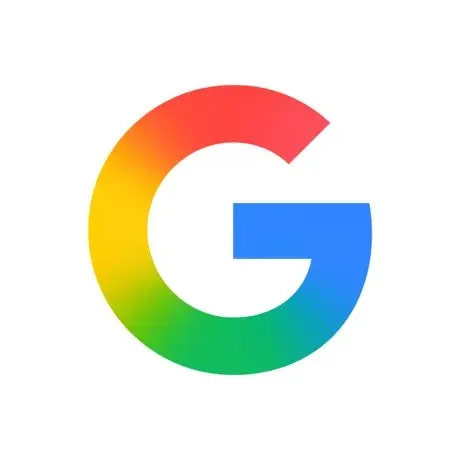
This new version feels more in line with Google’s evolving design language, especially the style used in its newer AI products like Gemini. It’s less about bold blocks of color and more about that modern, blended aesthetic that says, “We’re still fun, but we’ve matured.”
Right now, the gradient “G” is only showing up in the Google app on iOS and Pixel devices. If you’re on a different Android phone or browsing the web, you’ll still see the OG version for now.
So yes, it’s just a logo. But it’s the Google logo, and when something that iconic changes after 10 years, even a little, we can’t help but notice.
What do you think? Sleek upgrade or “if it ain’t broke, don’t gradient it”?


